|
Many people believe that a "garden" is, first of all, planting fruit or ornamental trees and shrubs, as well as herbaceous perennials. In fact, a well-planned garden is a volumetric-spatial composition in which all the elements of garden design make up a single whole.
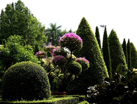
The word "composition" in translation from Latin means: composing, linking, joining parts. Thus, it involves creative activity in organizing space and its constituent elements. Natural materials: water, relief, woody and herbaceous plants, as well as small architectural forms - these are the elements that are used in landscape design for the artistic design of the garden space.
The expressiveness of a garden composition depends on the correct use of scale and proportionality of its elements. To maintain proportions, the unit is often used as a unit. In the photo of a flower clock, equal square modules are filled with flowers of different colors - this is an example of a simple proportion.
 |  |
Proportionality
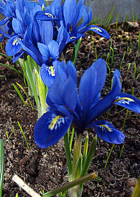
The harmonious ratio of parts of the composition to each other and the entire composition as a whole is called proportionality. In addition to a simple proportion, the golden proportion has been known since ancient times, which received its name "Sectio aurea" from Leonardo da Vinci. The Golden Ratio must be used in areas where large cottages occupy a large area in order to achieve proportionality between the house and the garden. Using the Golden Ratio in the garden, you can also determine the optimal location for eye-catching objects or ornamental plants. The essence of the principle is as follows: in order for the division of any space to be compositionally balanced, most of it should relate to the smaller one as the whole to the larger one. In other words, they should correlate with each other approximately as 5: 3 = 8: 5, which equals 1.62 when rounded. Scale - the visually perceived correspondence of the size of the elements of the composition to the environment and the person. On the site, as a rule, the size of the house sets the size of all zones of the garden and the size of the plants in it. A modest-sized house will be well complemented by low plants; around the cottage, on the contrary, you can use large-sized trees or compositions of shrubs planted in large groups. The existing tall trees in the garden will also help you select the right scale. They can either be supplemented with "anchor plantings" of shrubs, or used on an open lawn as a dominant. However, it must be remembered that the same elements of the composition, surrounded by objects of a larger or smaller size, look different. So in a garden, a pond or a paved area will be perceived as large if they are surrounded not by tall bushes, but by flower arrangements. Most of the area of many modern plots is occupied by a house, therefore, in order to achieve proportionality between the house and the garden, one has to resort to visual methods of increasing the area of the plot, using the laws of color harmony, linear and aerial perspective. The laws of perspective were discovered by the masters of the Renaissance, who developed a mathematically accurate system of depicting objects on a plane. Perspective, or "visible distance", includes objects to be viewed and an intermediate field with a point of view. Moreover, there should be a relationship between the beginning and the end of the perspective. Therefore, it is more logical to admire a decorated wooden well from the porch of a log house than an elegant gazebo or fountain. The visual change of objects as they move away from the observer is called linear perspective. You have probably noticed more than once how parallel lines of a long straight highway converge on the horizon, while the vertical lines (of pillars or trees along the highway) remain vertical, only decreasing in size. You may also notice that the shorter plants in the foreground (close to the viewer) appear taller than the taller trees in the distance. Therefore, you can deliberately "increase the depth of space" of your garden by planting larger plants in the foreground than in the distance and thus creating an artificial perspective. In addition, eastern park builders, in order to create the illusion of the depth of space, narrowed the paths leading from the entrance to the building, or brought the walls enclosing them closer. For the same purpose, you can reduce the size of the paving slabs and change the texture of their surface: from rough, "rough" - to smooth, "blurring" the contours of the path. Aerial perspective is associated with the property of the surface layer of air to soften the outlines of objects and their color, which loses its saturation. As you move away from the observer, the brightness and clarity of objects changes, so the color of trees and grass changes from saturated green to cold gray-blue. Light tones darken in the distance, and dark ones, on the contrary, brighten, therefore their contrast decreases with distance and on the horizon line the color of the forest, mountains and sea merges into a monotonous haze, forming "blue distances". The volumes located closer to the viewer are perceived as larger and more prominent. Therefore, to enhance the depth of the garden space, trees with a dense crown and a clear silhouette can be used in the foreground, and with openwork in the background. At the end of the garden paths, you can place plants or objects in gray-blue tones, and the color of the paving can be changed from warm reddish-orange to cold purple and gray. Since ancient times, the color has been attributed to mystical properties based on its perception by humans. In the color symbolism of the Ancient East: red meant virtue, yellow - health, green and blue - wisdom, white - cold and purity, black power and sin. I. Newton made an important discovery: "the sunbeam, which is perceived by the human eye as white, refracted in a trihedral prism, decomposes into seven colors of the spectrum." He also proved that this series of colors and their order are constant, thus creating the first "color scale". All of you have seen a rainbow more than once, which is formed by spectral colors (red, orange, yellow, green, blue, blue, violet), arranged in an order corresponding to the famous saying: "Every hunter wants to know where the pheasants are sitting." For a competent combination of plants of different colors and their placement on the site, it is necessary to take into account three main characteristics by which one color differs from another. Psychophysiologists have found that color is the first of the factors affecting a person, among sound, smell and taste. Therefore, in order to create an artistic garden on your site, in addition to knowledge of plant biology, it is necessary to take into account the laws of color harmony. 1. Chroma Color tone is characterized by the amount of light wavelength reflected by a surface. Therefore, green grass and yellow flower are identified with a certain tone. Spectral colors are usually represented as a color wheel divided into six parts. It includes 3 primary colors (red, yellow, blue) and 3 additional colors (orange, green, purple). Depending on the level of detail of the shades, the color wheel can be divided into 6, 12, 18 and more parts.So, the color wheel, consisting of twelve parts, includes, in addition to the seven colors of the spectrum, purple (obtained by mixing red and purple), as well as shades: light green (yellow-green), golden (yellow-orange), crimson (orange -red), cornflower blue (blue-violet) and turquoise (blue-green). Research by scientists has revealed a close relationship between color and the physiological and emotional responses that it causes. Yellow is like the sun: the lightest spot is the solar disk, and from it the light radiates in concentric circles, losing its brightness and expanding the space. The blue color is like a whirlpool funnel "sucks and absorbs" the space, its center is the darkest place. According to the degree of excitement and the nature of the impact, colors are usually divided into warm and cold. Warm tones always seem larger and closer: they seem to come forward, and cold ones recede and seem farther. Warm yellow-orange-red colors of "fire and sun" are more joyful and active. They are preferred by people with a dynamic character: emotional, passionate, energetic. These tones evoke a feeling of joy and cheerfulness, and their muted cream and pink shades - a feeling of comfort and peace, harmony and well-being. Cool greens, blues and purples are associated with shade and coolness. Light shades of blue and green are soothing, while dark and purple shades evoke feelings of anxiety, sadness and restlessness. Cool tones are preferred by calm and delicate people, with a creative approach to life and striving for emotional comfort. 2. Saturation In total, there are about 130 color tones in the visible spectrum. The difference between them is provided by the second characteristic of color - saturation. It helps determine how much the color of one plant looks brighter or more subdued than another. Spectral colors have the maximum saturation: it is taken as 100%. Yellow and orange plants (evening primrose, solidago, escholzia) have the greatest saturation, since their color is almost close to the spectral one. Plants with red flowers are also rich in color: roses, tulips, peonies, poppies. Blue, blue and purple plants (forget-me-nots, Japanese iris, cornflowers) have a low saturation. And achromatic: white, black and gray - can be called colors with zero saturation. 3. Lightness Achromatic, which in translation means "colorless", instead of chromaticity have one characteristic - lightness. It serves as a measure of brightness and is the third characteristic of color. Compare dark purple aquilegia and light purple bush aster or pale pink subulate phlox with dark pink primrose. With the same saturation, the color of these plants has a different lightness. When you start decorating the site, you need to decide: will your garden be bright, immersed in a variety of colors, or do you want to create a calm, pastel composition of plants. In any case, one should adhere to certain rules for combining colors, which affect the psychological and physiological state of a person in different ways. Harmonious flower beds, designed for quiet contemplation, are located near the gazebo or in the recreation area. Most of all, discreet pastel colors (lilac, golden, white) are suitable for their creation. In partial shade, contrasting flower beds can also be created, but from plants of "bleached" tones (blue, pink, lilac and cream). Monochromatic combinations can be created from three or more types of plants that are the same in color tone, but differ in lightness and saturation. Moreover, the color intensity should increase from the edge to the center of the flower garden. Such combinations are characteristic of monochrome blue, pink or white gardens. Compositions can be varied with creamy plants or silvery ornamental foliage.When creating contrasting flower beds, plants are used whose color is opposite each other in the coloristic circle: yellow and purple, red and green, blue and orange. In such combinations, the tonality of the color of plants is enhanced: for example, dark red flowers against a background of light green appear darker. However, too sharp a contrast tires the eyes, so plants that create contrasting combinations should make up about 1/5 of the flower garden, and the rest of the area should be occupied by plants of neutral tones: gray-blue, white or green. Three-tone contrasting combinations are obtained using the so-called triads of primary colors (yellow, red, blue) or additional (green, orange, purple). However, it is very important to correctly observe the proportions of each color in the plant composition. Contrasting flower beds encourage action, therefore they are more appropriate in the entrance and front area, near children's and playgrounds. Multi-tone combinations involve the use of four, five or more spectrum colors in a composition. When several spectral colors are combined, the dominant color is always the main color. For example, when creating flower beds in cold colors, the emphasis should be on blue, and purple, lilac and lilac will complement and shade it. When cold and warm tones are combined in the composition of plants, the contrast is softened by the transition of blue to purple and then to a pinkish-lilac shade, and yellow through golden to cream. However, the creation of such flower beds requires deep knowledge of color. With the right combination of plants of different colors and their placement on the site, taking into account the illumination, you can create a truly artistic garden. Since the observance of the laws of color harmony creates a feeling of complete balance in the eyes, and gives rise to a feeling of peace and tranquility in the soul. "Garden affairs" No. 2 (64) - 2-13
Scale


Linear perspective
Aerial perspective

Color laws


Color combinations for creating flower beds